10 Powerful CRM Dashboard Charts You Should Be Using
🔹 Introduction: Why Visual Dashboards Matter
In today’s fast-paced business environment, data alone isn’t enough. What truly matters is how quickly and clearly you can interpret that data to make informed decisions. That’s where CRM dashboards come into play. A well-designed dashboard gives you instant visibility into the health of your sales pipeline, the performance of your team, the effectiveness of your marketing campaigns, and the satisfaction level of your customers—all at a glance.
With Atwork, you can create customized dashboards using visual elements like charts, graphs, and KPIs without writing a single line of code. Whether you’re a startup founder, a sales manager, or a customer success specialist, these dashboards can turn your raw data into actionable insights.
Let’s explore 10 of the most effective dashboard charts every CRM should have.
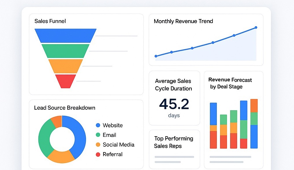
1. 📊 Sales Funnel Chart
The sales funnel chart is one of the most fundamental components of any CRM dashboard. It visually represents how leads or deals move through various stages of your sales process—from initial contact all the way to closing.
Each stage of the funnel (e.g., New Lead → Contacted → Qualified → Proposal Sent → Closed) is displayed as a narrowing segment, showing the number or value of opportunities that make it to each level. The funnel naturally gets narrower as deals drop off or progress.
Why it matters:
This chart helps you quickly identify where prospects are getting stuck or lost. For example, if a large percentage of leads are dropping off at the “Proposal Sent” stage, it may signal issues with your offer, pricing, or timing. With Atwork, you can filter the funnel by salesperson, product, or timeframe for deeper insights.
2. 📈 Monthly Revenue Trend
Revenue is the ultimate indicator of business health, and a monthly revenue trend chart gives you a clear picture of how your income is growing—or declining—over time.
This line or area chart tracks revenue generated month by month, providing a continuous visual of your financial progress. You can also compare current performance with past periods, forecasts, or goals.
Why it matters:
By identifying revenue trends early, you can take corrective action when sales begin to dip or double down on strategies that are working. In Atwork, this chart can be connected to your closed deals, subscription renewals, or invoices for real-time tracking.
3. 📍 Lead Source Breakdown
Not all leads are created equal. Some channels bring high-converting prospects, while others may generate quantity over quality. The Lead Source Breakdown chart—often visualized as a pie or donut chart—shows the distribution of your leads based on where they originated (e.g., Website, Google Ads, LinkedIn, Referral, Events).
Why it matters:
This chart helps your marketing and sales team understand which acquisition channels are most effective. For instance, if 70% of your high-value clients are coming from LinkedIn campaigns, you might decide to invest more budget into that platform. Atwork allows you to add custom tags or fields to track lead sources easily.
4. 👥 Top Performing Sales Reps
Your team is your most valuable asset, and this bar chart highlights the performance of individual sales representatives based on key metrics like deals closed, revenue generated, or number of activities completed.
Why it matters:
This chart isn’t just about recognizing top performers—it’s also a diagnostic tool. If one rep consistently underperforms, you can intervene early with coaching or support. Similarly, understanding the methods of top performers can help train newer team members. In Atwork, you can also link these performance charts to incentives or bonuses.
5. ⏳ Average Sales Cycle Duration
Knowing how long it takes to close a deal can help you forecast more accurately and identify inefficiencies in your sales process. The Average Sales Cycle Duration chart calculates the time between the first contact with a lead and the final closing date.
Why it matters:
A longer sales cycle may indicate unnecessary complexity, lack of follow-up, or weak qualification at the beginning of the process. A shorter cycle can mean your team is efficient and your offer resonates well. With Atwork, you can display this metric as a KPI block or time trend for ongoing monitoring.
6. 🎯 Deal Status Overview
This dashboard chart offers a comprehensive look at the current state of your deals. It categorizes deals by status—Open, In Progress, Under Review, Won, or Lost—giving you a quick overview of your sales pipeline.
Why it matters:
Understanding the distribution of deals across various statuses helps prioritize daily sales activities. If many deals are stuck in the negotiation stage, it might be time to push harder or offer incentives. Atwork lets you drill down into each segment of the chart for detailed insights, such as deal owner or potential value.
7. 🛎️ Customer Support Response Times
Customer experience is a critical differentiator in any industry. This chart shows the average time it takes for your support team to respond to customer inquiries, resolve tickets, and follow up on issues.
Why it matters:
Slow response times can lead to frustration and churn, while quick replies build trust and satisfaction. This line chart or gauge can help support managers spot delays, assign more resources, and monitor performance over time. With Atwork’s automation tools, you can even set up alerts for overdue tickets.
8. 💼 Customer Segmentation by Industry or Region
This stacked bar or multi-category pie chart segments your customer base by key attributes like industry type, company size, or geographic region.
Why it matters:
Understanding your customer segments helps you personalize your approach, refine your messaging, and uncover opportunities in under-served markets. For instance, if most of your clients come from the tech sector in North America, you may consider creating region- or industry-specific campaigns. Atwork allows you to filter and group data effortlessly with drag-and-drop tools.
9. 📅 Upcoming Follow-Ups
Missing follow-ups is one of the top reasons deals go cold. This dashboard chart (usually in calendar or Gantt-style format) shows all scheduled tasks, follow-up calls, emails, and meetings.
Why it matters:
It ensures your team stays on top of their commitments, builds stronger relationships, and improves conversion rates. In Atwork, you can combine this view with reminders and automatic task creation after key CRM events (like a form submission or deal stage change).
10. 💸 Revenue Forecast by Deal Stage
This chart estimates future revenue based on your current pipeline and the probability of deals closing at each stage. It often uses a weighted model, multiplying the deal value by a confidence percentage based on how far along the deal is.
Why it matters:
Revenue forecasting is essential for budgeting, planning hiring, and communicating with stakeholders. It also helps managers set realistic goals. Atwork’s flexible dashboard builder allows you to assign custom probability values to each stage and visualize the expected revenue curve dynamically.
🧩 Building These Dashboards in Atwork
Atwork makes creating dashboards a breeze. You can:
- Use the visual chart builder to create line, bar, pie, funnel, and KPI widgets.
- Apply custom filters and formulas to shape your data exactly how you want.
- Embed charts directly into your CRM tables, contact views, or shared team dashboards.
- Let AI Agents like Brian help identify patterns, anomalies, and trends automatically.
No coding. No complex setup. Just drag, drop, and get insights.
✅ Final Thoughts
Visual dashboards are more than eye candy—they’re strategic tools that empower you to make faster, smarter business decisions. The right combination of CRM charts can boost transparency, align your team, and increase your chances of success.
With Atwork, anyone on your team can design powerful, real-time dashboards tailored to your specific goals. Whether you need to track leads, analyze sales trends, or improve support performance, these dashboards will give you the visibility you need—all in one place.